Identity Instituto Contra el Dolor Dr. Trinidad
The Instituto Contra el Dolor, directed by Dr. Trinidad, commissioned us to create their new corporate identity for the Pain Unit. This unit covers all pain treatments and techniques to alleviate pain. For several years, Dr Trinidad and his team have been positioned as one of the leaders in this field of medicine, being one of the most highly valued specialists at a national level.
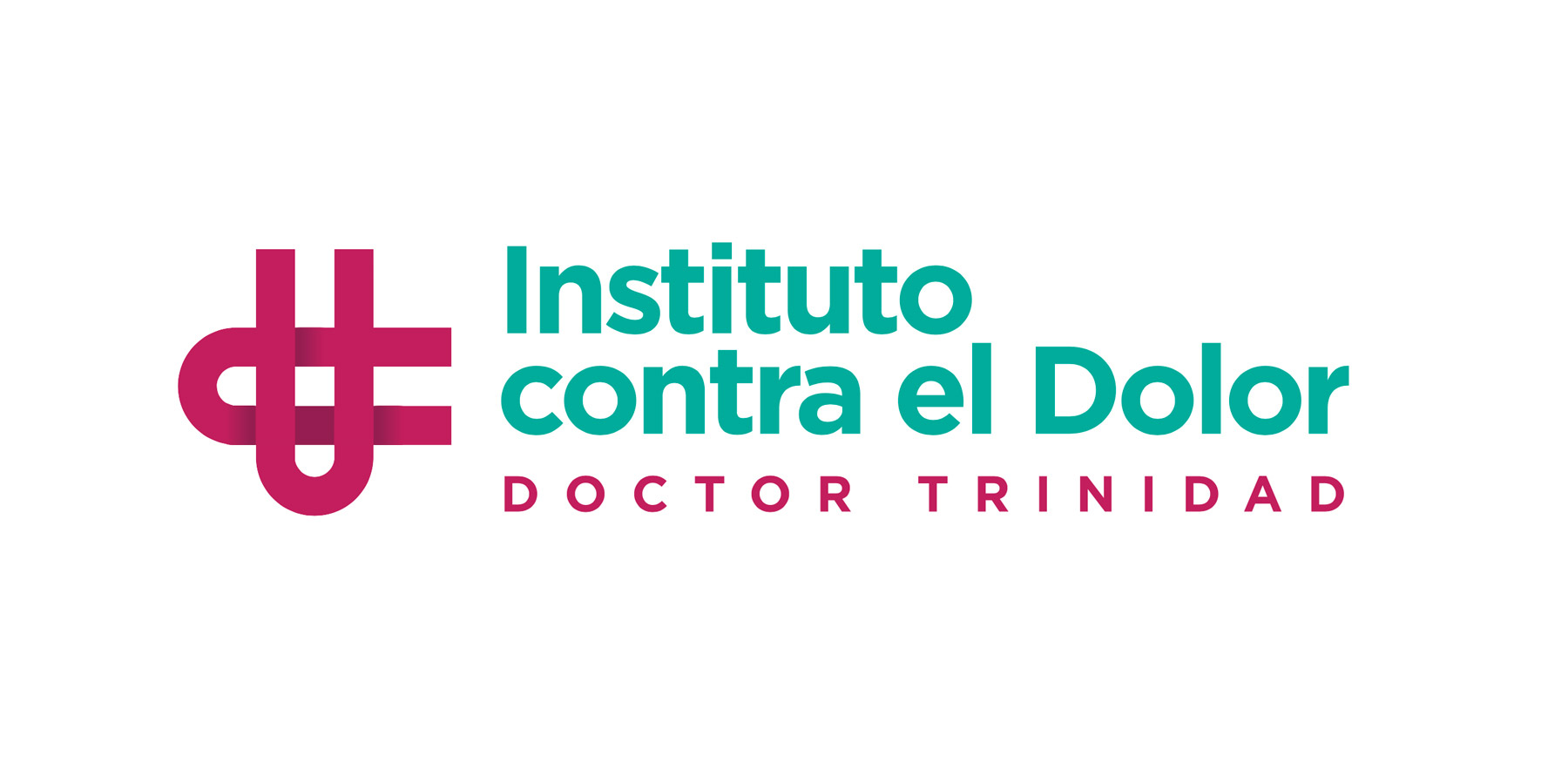
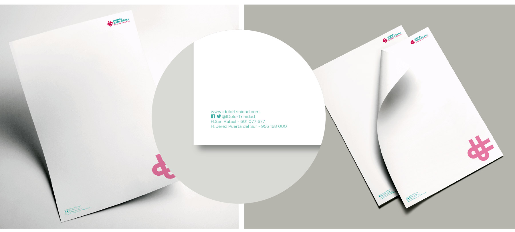
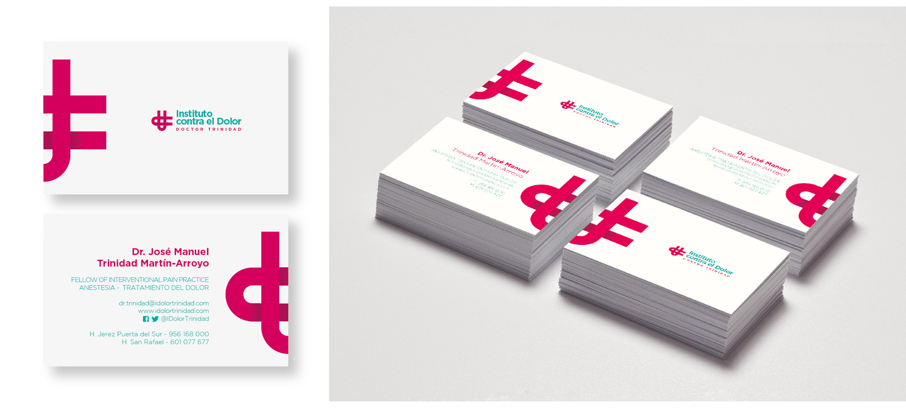
The identity was an interesting challenge. The client wanted a modern image, moving away from the classic logos that for years have been positioned with the medical sector. We developed a graphic image in colours, where a "d" for Doctor and a "t" for trinity coexist. In addition to this, as a global image, a cross is identified as the main health element. All in dark magenta and aqua green for the typography.
A job with which we have been very happy, and above all, where the client has been very happy, which is the most important thing.
CustomerDr. Trinidad Pain InstituteServiceBranding, IdentityYearApril 2017
Share